Japan Airlines Lets Its Crane Fly Again
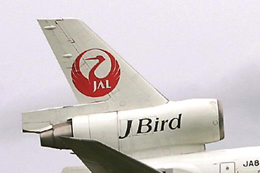
In the infancy of Japan Airlines (JAL), in 1954, the company adopted the symbol of the red crane for its livery, playing on the symbolism of honour and loyalty in Japanese culture. Since the airline adopted the crane logo it became a worldwide symbol for the airline … until it was completely phased out in May 2008.
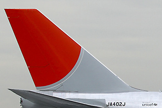
At the time JAL began phasing out its famous crane logo the airline entered a period of financial ruin and entered into one of the largest bankruptcies in Japan’s history. To many, the newer ‘bloody sword’ logo that replaced the Crane, as its new livery has been nicknamed, is seen as a symbol of the airlines failures.
Now, as JAL restructures and works to return to its former status as the top airline in Japan and a premier global carrier, they are bringing back the Red Crane logo. In addition to the crane symbolizing loyalty and honour … it is also a symbol of luck.
Hopefully the Crane once again becoming the symbol for JAL will bring the airline luck and prosperity.
Below is a photo of the old JAL livery with the crane and photo of the current ‘the bloody sword’ livery.
Happy Flying!